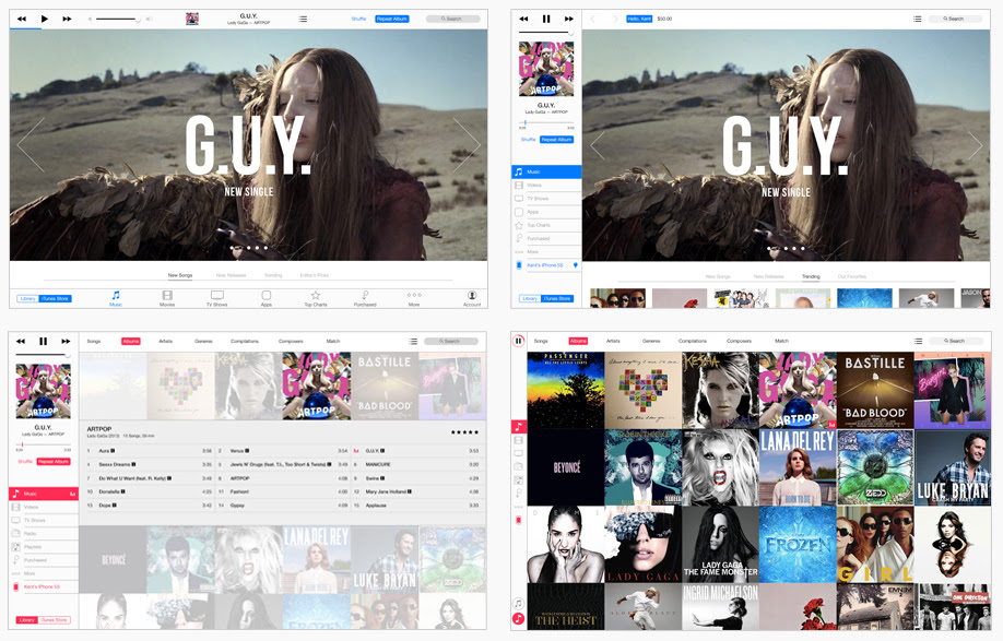
Brye Michael Kobayashi, a student at the University of Hawaii at Manoa, has posted his concept for an iTunes redesign inspired by iOS.
"iTunes is one of the most essential applications on OS X", says Kobayashi. "For many of us, it aggregates all our music, movies, apps and backups for our devices. While over the years updates have added functionality, the overall experience hasn't really changed."
Some issues he found with the current version of iOS include:
● Drop down menu to switch libraries is confusing and adds another unnecessary step.
● Narrow rows and small text reduces visibility.
● Disconnect between old and new design style.
● Multiple scrolling lists and small banners overwhelm the experience.
● Home page cluttered with random assortment of media.
● Quick links are mostly pointless and take up valuable x-axis space.
Kobayashi decided to use a sidebar for navigation in his concept. The music playback controls are located in the sidebar as well and have a layout that mimics the iOS Music app. Six tabs correspond to the type of media and stay the same when switching between the store and your library. Less used categories are stored in the More tab, and can be rearranged just the way you like. A segmented control lets you flip between the iTunes Store and your Library.
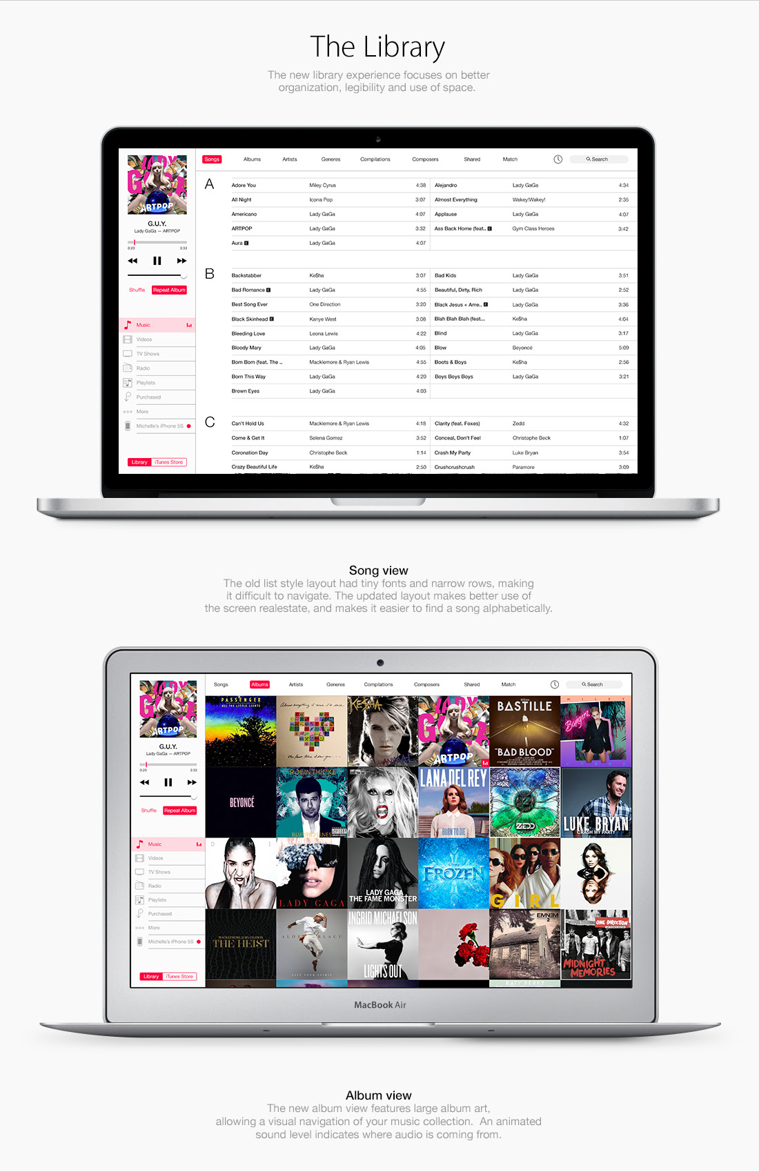
The new Library experience focuses on better organization, legibility, and use of space. The song view has been updated to make better use of screen real estate and make it easier to find songs alphabetically. Album view features large artwork for visual navigation and a sound level indicates where audio is coming from.
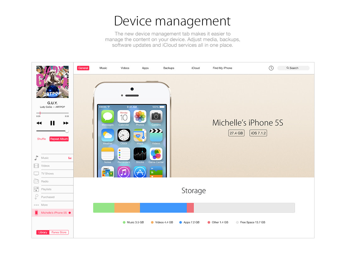
The device management tab puts media, backups, software updates, and iCloud service all in one place.
Take a look at a few screenshots below or hit the link for more. Let us know what you think in the comments...
Read More


0 comments:
Post a Comment