![Leaked Video of iOS 7 Running on an iPad? [Watch]](http://www.iclarified.com/images/news/31232/127037/127037-128.png)
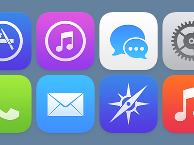
Louie Mantia, a former designer at Apple and Square, has posted a redesign concept for the icons in iOS 7.
One of the most disliked features in the iOS 7 has been the new SpringBoard icons. Complaints about the style and colors have led to numerous redesigns already. Mantia keeps the same style in mind but tweaks the colors and spacing to create a more balanced result.
Almost a year ago, I took a day or two to redraw the iOS icons. Since then, Apple's introduced iOS 7, with a visual style that is fascinating and new. The talented people at Apple have worked really hard to create something pretty cool for us.
Today, I revisited that original task and took about a day to understand the new style. Simpler, smoother, subtler. While I don't employ the grid they created (and while I instead use the colors I chose), these feel interesting and balanced. Vibrant and bold, but not overbearing.
Take a look at his design below. You can also check out a comparison of the old iOS icons and the new oneshere. Which do you like best?
Read More [via CultofMac]


Apple's:


0 comments:
Post a Comment